| XLCubed is now FluenceXL. The new wiki can be found here: https://help.fluencexl.com/ |
Difference between revisions of "Comparison Chart Designer"
| Line 47: | Line 47: | ||
==See Also== | ==See Also== | ||
| − | [[XL3SparkCompare]] Formula | + | * [[XL3SparkCompare]] Formula |
[[Category:In-Cell Charts]] | [[Category:In-Cell Charts]] | ||
[[Category:In-Cell Chart Designers]] | [[Category:In-Cell Chart Designers]] | ||
Revision as of 12:00, 12 March 2020
This dialog is used to format any Comparison In-Cell Charts in your report.

For details about how to invoke the dialog, see In-Cell Chart Designer.
Comparison Options
- Chart Type
- Choose between the following types of charts:
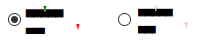
- Integrated Variance:

- Indictor Comparison:
- Compare Values
- The range of data to use for comparison.
- Width
- The width of the chart
- Positive Value
- The default colour to use for positive values
- Negative Value
- The default colour to use for negative values
- Increase
- The default colour to use for an increase in value.
- Decrease
- The default colour to use for a decrease in value.
Axis Options
- Customise axis
- Allows you to choose further options defining how the formula cell (for In-Cell Chart formulae), or the member name (when used in Grids) is rendered
- Use title only
- Uses the given text as a caption
- Axis with tickmarks above
- Draws a horizontal axis, with tickmarks and optional labels above the axis
- Axis with tickmarks below
- Draws a horizontal axis, with tickmarks and optional labels below the axis
- Custom tickmark frequency
- Overrides the automatic calculation of major tickmarks
- Minor ticks per major tick
- Adds the given number of minor (labelless) tickmarks between each major tickmark
- Show labels on major ticks
- Specifies whether numeric labels should be rendered for the axis
- Number format
- The format string to be used for the axis labels
- Custom axis minimum
- Overrides the automatic minimum for the axis
- Custom axis maximum
- Overrides the automatic maximum for the axis
See Also
- XL3SparkCompare Formula