| XLCubed is now FluenceXL. The new wiki can be found here: https://help.fluencexl.com/ |
Grid Charts
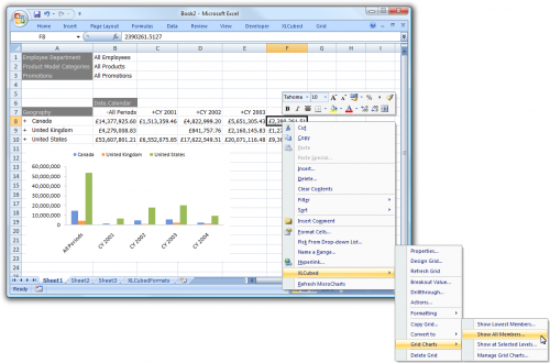
Grid Charts introduce truly dynamic charting to XLCubed. One or more Grid charts can be tied to each Grid. You have the ability to specify the level being charted (Entire Grid / Specific Level / Lowest Level) as shown below, and the charts will change, grow and shrink with the Grid. Once created, the Grid chart can be sized and formatted as with a standard Excel chart.
To create a Grid Chart, right-click on a Grid and choose XLCubed > Grid Charts and then the type of Chart.
Contents
[hide]Chart Types
Show Lowest Members
This option charts the cross-section of the lowest levels in the Grid:
Show Highest Members
Available from Version 8, this option charts the cross-section of the highest levels in the Grid. Useful when the chart should remain stable, even after drilling:
Show All Members
This option creates a Grid chart which shows details of the entire visible Grid:
Show at Selected Levels
The levels option allows you to select which levels of the Grid hierarchies are used for the chart:
Configuring Existing Charts
Right-clicking a Grid and choosing XLCubed > Grid Charts > Manage Grid Charts... allows you to change the chart type and what members are being charted.
Time Series Graphing
This example shows a technique for displaying a time-series graph. It is based on data in Adventure Works cube.
You can download the Excel spreadsheet that is used in the example here File:TimeSeriesGraphFromSlicer.zip
The report is based on a slicer that allows the user to switch between showing the graph data based on quarters, months or days.
Workbook Sheet - Chart
This sheet shows the graph based on the data chosen in slicer above it. This switches the graph data between quarters, months and days depending on the slicer selection.
Workbook Sheet - GridForChart
This shows the data that will be graphed, depending on the choice made by the slicer selection. In this example it is months July 2001 until June 2002. FY2002 has been selected by the user (in this example Financial Year 2002 runs from July 2001 until June 2002).
Note that cells A10:A21 contain the value ‘TRUE’ – these cells contain an XL3RowVisible statement as follows:
=XL3RowVisible(B10<>"")
This statement hides rows with no data so that they are not plotted on the graph.
Workbook Sheet - SlicerToMonthDay
This sheet contains the data that is returned by the choice of the slicer in workbook sheet Chart.
- User selects a month
The data will be graphed as days. For example, if the user selects July 2002 then the graph will be displayed with each day in July along the x-axis. These are defined in XLCubed as Children of the slicer.
- User selects a quarter year
The data will be graphed as months in a three month period. For example, the user selects Q1 FY 2003 and the data displayed is for three months from July 2002 through to September 2002 as below. These are defined in XLCubed as Descendants of the slicer at month. This will be the same when the user picks year, half-year or quarter.
- User selects a half-year
The data will be graphed as months in a six-month period. For example, the user selects H1 FY 2003. The screenshot below shows the data that will be graphed. However, it can be seen that the values Q1 FY 2003 and Q2 FY 2003 should not appear on the graph.
Using the Edit Member functionality it is possible to remove these so that they do not appear as points on the graph.
Edit the Date.Fiscal member and in Advanced tab you see that the data in cell C2 in sheet Chart is to be subtracted from B10 – B43 in sheet SlicerToMonthDay .
The GridForChart sheet now shows just the six months that should be graphed. As explained earlier further manipulation using the XL3RowVisible functionality removes blank rows.


