| XLCubed is now FluenceXL. The new wiki can be found here: https://help.fluencexl.com/ |
Business Charts
A new range of business focused chart types were introduced in Version 10. They draw on the visualisation standards of IBCS, a structure of guidelines for consistent and clear business communication.
Contents
[hide]Chart Types
Absolute Variance
| Displays the variance between two values, often between the budget and actual values. For more information, see Variance Charts. |
Relative Variance (%)
| Displays the relative variance between two values. For more information, see Variance Charts. |
Integrated Variance
| Shows the actual and variance in the same chart with colour indicating the direction of the variance. For more information, see Variance Charts. |
Indicator Comparison
| Shows actual and target values in one chart. The arrow position and colour indicate the target value and direction of the variance. For more information, see Variance Charts. |
Offset Comparison
| Shows actual and target values in one chart. The actuals are prominent while the target values can still be referred to. For more information, see Offset Comparison Charts. |
Business Scenario
| Shows actual and forecats values in one series. By default the actual values are used where available otherwise the forecast is show, however you can specify the first forecast member to override this behaviour. For more information, see Business Scenario Charts. |
Waterfall
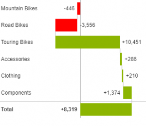
| Show the structural breakdown of business attributes. Totals and sub-totals can be specified either on individual elements (right-click) or using member properties if available in the cube. For more information, see Waterfall Charts. |
Variance Waterfall
| Specialised waterfall chart to show the breakdown of a change by a business attribute. Select the time periods to analyse and then the attribute to show detail by. Outputting cells If you have split by a different category hierarchy and want to output the category to excel then you can pick a range of two cells to put the values in. The first will contain the date member, the second the split-by member. For more information, see Waterfall Charts. |
Waterfall Deltas
| Specialised waterfall chart to show the deltas between two members split by any category. For more information, see Waterfall Charts. |
Trend Comparison
| Shows two time series and their variance, colours indicate direction of the variance. |
Trend Comparison (Cumulative)
| Shows two time lines as cumulative totals, and indicates the total variance over time. |
Formatting
Ribbon and Formatting Taskpane
Within the Dynamic Chart Ribbon is the option to turn on 'Message' formatting. This applies the IBCS style of formatting, removing the value axis and instead showing data labels.
Here you can also access the formatting taskpane to make formatting changes to the chart.
Right-Click Options
The right-click menu offers some direct formatting on areas of the chart. Category formatting applies to all series in the category, whereas Data Point formatting will only apply to the selected series in that category.
The solid/outlined/hatched styles are applied automatically by Business Rules, but these options allow for finer control over formatting of individual categories.
By selecting the Category > Customise... or Point > Data Point options, you configure individual formatting options. Apply to following points makes the the formatting apply to all points after the current one, so you do not need to set the same formatting multiple times.


