| XLCubed is now FluenceXL. The new wiki can be found here: https://help.fluencexl.com/ |
Difference between revisions of "Category:Small Multiple Charts"
(→Legend) |
|||
| Line 81: | Line 81: | ||
| [[File:SmallMultiplesNoHighlight.png|thumb|none|Normal]] || [[File:SmallMultiplesHighlight.png|thumb|none|Highlighted Series]] | | [[File:SmallMultiplesNoHighlight.png|thumb|none|Normal]] || [[File:SmallMultiplesHighlight.png|thumb|none|Highlighted Series]] | ||
|} | |} | ||
| + | |||
| + | |||
| + | ==Properties== | ||
| + | |||
| + | Some customisation of the charts can be dont from the properties screen, found by right clicking the chart. | ||
| + | |||
| + | [[File:SmallMultiplesProps.png|thumb|none|Properties]] | ||
Revision as of 15:02, 11 March 2011
Contents
[hide]Introduction
Small multiple charts is a term popularised by Edward Tufte. They allow comparing data series as they are repeated for different members.
In XLCubed they are useful for visualising large amounts of data, as hundreds of data points can be plotted and compared easily.
This allows users to find trends and outliers in the data more easily than by trying to study a large table of data.
UI
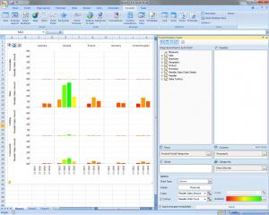
To create a small multiple click the menu item on the ribbon/toolbar. A blank chart and the small multiple task pane appear.
The task pane is the designer for you chart, and supports drag drop and the familiar XLCubed Member selector.
Hierarchy positioning
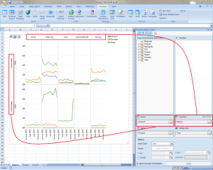
On the small multiple pane there are 4 boxes you can drop hierarchies in.
Two are familiar from normal Excel charts. The "Categories" box defines the members that appear on the X-Axis, and the "Series" box defines the members that will display as a separate series.
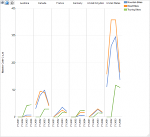
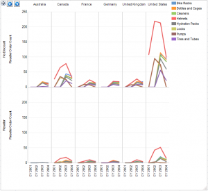
The "Rows" and "Columns" boxes define how the charts are repeated, best shown by an example
Clicking a hierarchy once it is in a box brings up the member selector with the usual XLcubed options including drive from range and linking to slicers.
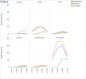
Wrapping areas
If you only select a hierarchy on "Columns", but not on "Rows" then wrapping is enabled. To turn this on select the checkbox next to the "Columns" hierarchy.
This means that the charts will not all be on the same line:
Chart appearance options
The "Options" section on the task pane allows you to pick some chart styles.
The simplest allows you to change chart type to some of the standard types; column, bar, line so on.
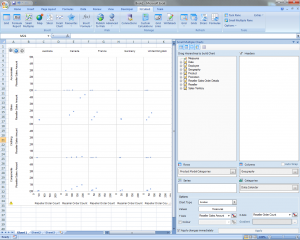
The next options allow comparing two numbers directly in the chart, most often in the form of an X-Y scatter plot.
To do this drop a hierarchy (usually measures) onto the "Value Hierarchy" box, and pick "Scatter" from the Chart Type selector.
Next, you'll be prompted to pick members for the X and Y axes, and these are plotted against each other.
The colour option is similar, but uses the secondary measure to set the colour of the data point.
Fill these in and then the chart will display:
Chart Interaction
Selections
Once you have created a chart you can interact with it in order to get more detail about a particular section.
Members on Columns and Rows can be "Drilled Into". This is similar to drilling a grid to see a member's children, but with small multiples the parent is removed, and only the children shown. This is so that the parents data do not dwarf the children's.
Drilling can be done on either a Columns or Row label, or on a chart area.
Right click menus on the labels allow "Keep Only" and "Keep All Except" so you can easily refine the selections.
Back and Forward
There are back/forward buttons in the top left of the chart. If you drill into a chart you can use the back button to undo this, and could then go into a different area to get its details.
Legend
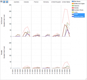
Clicking on legent items highlights the related series. This can be useful if the data overlap as it makes the series you select stand out. You can use Ctrl+Click to multiselect.
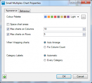
Properties
Some customisation of the charts can be dont from the properties screen, found by right clicking the chart.
Pages in category ‘Small Multiple Charts’
The following 13 pages are in this category, out of 13 total.
